We kept the design classic for Margaret-Anne and Duncan’s rehearsal dinner invitation. Letterpress printed on Lettra Pearl 220# cover using Black ink.
Archives
Ashley + Brendan
Julie + Christopher
Featuring some Flashback Designs from throughout all the years we have been designing wedding invitations, a time of MySpace and Tumblr, pre-dating Facebook if you can even image. This letterpress wedding invitation featured a retro floral design with Silver Ink on Pearl colored paper with a RSVP postcard which was very popular in the early…
Melanie + Nick
Melanie and Nick were married in Cape May, NJ a place where my sister and I have spent many years going to so this was an exciting wedding to work on. We used our Caught in Love design with Hunter Green ink on Lettra Pearl paper, the envelopes were lined with Metallic Gold paper.
Madeline + Samuel
Madeline and Samuel’s Austin, Texas wedding went with a customized Wallflowers design with Cherry and Grape ink colors on Ecru paper.
Ha + Kenny
Ha and Kenny’s wedding invitation features a monogram featuring their first initials as well as simple floral line art. Paired with Colorplan envelopes in Mid-Green that went well with the Slate gray ink used.
Nicole + Seth
Nicole and Seth wanted a modern minimal layout for their invitation suite. We ended up with the design below that featured a stylized small caps font with flush left text and a dark gray envelope liner that tied it all together.
Lindsay + Dan
Lindsay and Dan were married upstate at the beautiful Onteora Mountain House. Their suite was filled with tons of different botanicals using different shades of green ink. The day-of items compliment their amazing wedding florals. Had such a great time working with them. Venue photos were taken by Jesse Pafundi of Golden Hour Studios.

Irena + Zach
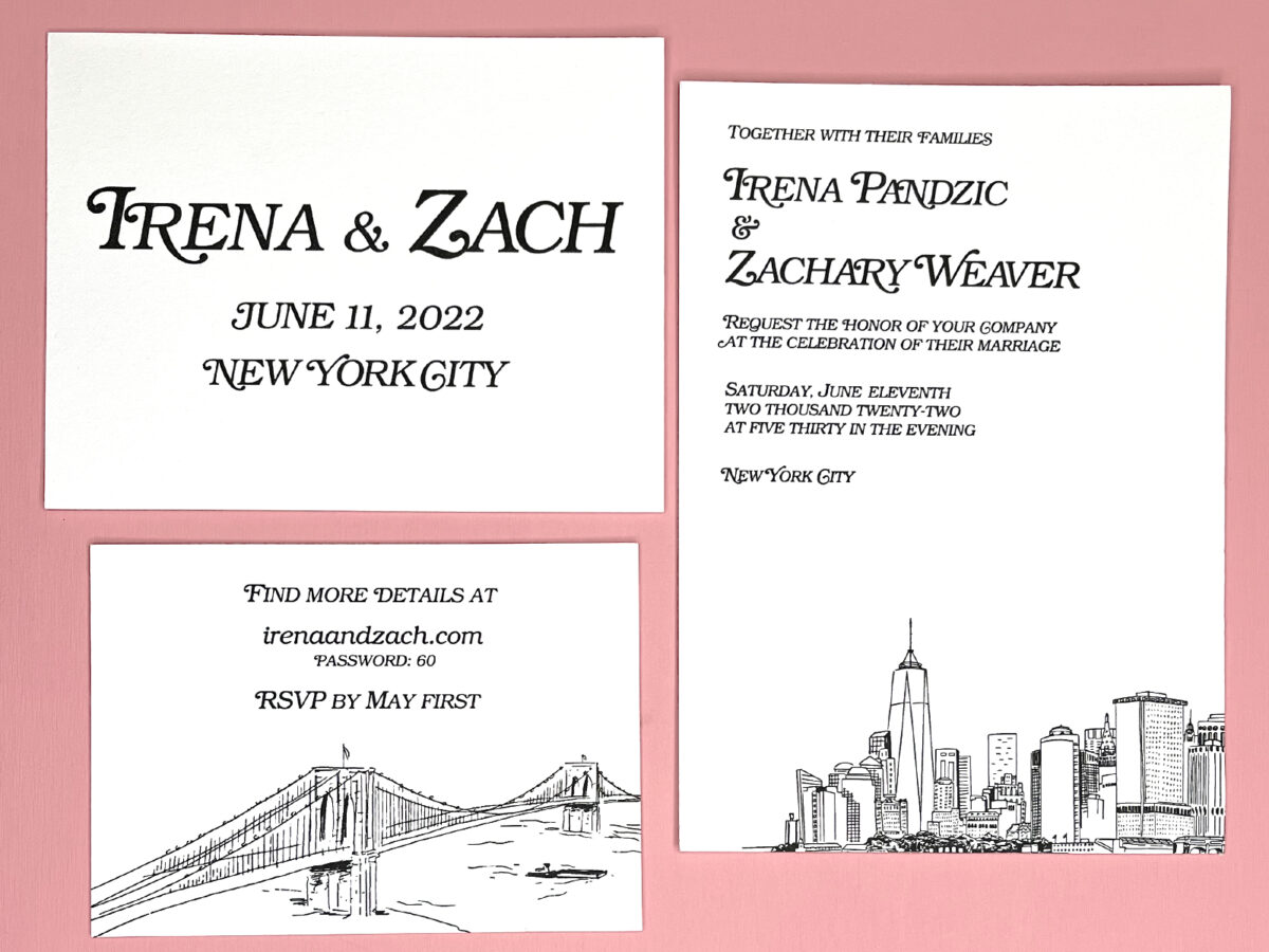
Loved working with Irena and Zach on their invitation suite. The simplicity of the save the date was a play on the New York Magazine logo. We carried that font throughout the designs.
Nancy + David
Nancy and David’s used our Love Letters design with Leaf colored ink. With the custom addition of a bookmark they were using as a favor. The were married at Saddle’s which is known for their bagels so we had some fun with the favor design.


